

27 August, 2024
The Psychology of Colour in Cap Branding: A Journey Through Hue
Ever wondered why some caps make you feel zippy and others more relaxed than a koala on a lazy Sunday arvo? Well, it's all down to the nifty psychology of colour in cap branding! Time to take a fun stroll through this vibrant world and see why colours affect us so much and in what way.
The Colourful Hat-rick: Reds, Blues, and Beyond
1. Fiery Red Cap
Characteristics: The fiery red cap isn't just a head-turner; it's a bold statement piece. This colour embodies energy, passion, and a cheeky attitude.
Symbolism: Red is often associated with dynamism and excitement. It's a colour that doesn't just sit quietly; it's more like a loud, friendly shout of "G'day, world! I'm here!"
Ideal for: This vibrant hue is perfect for sports brands or anyone looking to project confidence and vitality. It's for those who aren't afraid to stand out and make a statement.
2. Cool Blue Cap
Characteristics: This is like the laid-back cousin in the colour family. It's understated yet confident.
Symbolism: Blue speaks of trust, reliability, and calmness. It's a colour that exudes a quiet confidence, reassuring others with a "No worries, mate, I've got this" kind of vibe.
Ideal for: They are a hit with corporate brands and individuals aiming to project professionalism and reliability. It's a colour that resonates with a sense of steadiness and trustworthiness.
3. Earthy Green Cap
Characteristics: It is all about connecting with nature and promoting a sense of wellbeing and health.
Symbolism: Green is the colour of the natural world, symbolising growth, harmony, and freshness.
Ideal for: They are fantastic for eco-friendly brands or initiatives promoting sustainability and health. They communicate a commitment to the environment and a healthier lifestyle.
4. Sunny Yellow Cap
Characteristics: These radiate happiness and optimism, much like a burst of sunshine on a clear day.
Symbolism: Yellow is often associated with joy, energy, and positivity. It's a colour that can lift spirits and inject a dose of cheerfulness.
Ideal for: Perfect for brands or individuals wanting to convey a sense of fun, creativity, and brightness. Yellow caps can be great mood boosters and conversation starters.
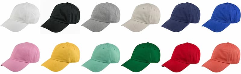
5. Royal Purple Cap
Characteristics: They carry an air of creativity and luxury and are less common, which adds to their unique appeal.
Symbolism: Purple has long been associated with royalty, luxury, and sophistication. It also represents creativity and imagination.
Ideal for: Perfect for those who want to stand out with a sense of elegance and artistic flair. It's like having a secret superpower of sophistication and creativity.
6. Vibrant Pink Cap
Characteristics: It is a playful and spirited accessory. It's lively, fun, and exudes a youthful charm.
Symbolism: Pink is often associated with playfulness, warmth, and affection. It's a colour that speaks of a carefree spirit and a friendly, approachable personality.
Ideal for: Perfect for brands or individuals that want to project a sense of fun, approachability, and a touch of whimsy. Pink caps are great for making a bold, yet tender statement, often appealing to younger demographics or those young at heart.
7. Sleek Black Cap
Characteristics: This is the epitome of versatility and sophistication. It's stylish, elegant, and goes with just about anything.
Symbolism: Black is a powerful colour, symbolising authority, strength, and sophistication. It's a colour that suggests decisiveness and seriousness.
Ideal for: Brands or individuals aiming for a classic, timeless look. Black baseball caps are perfect for those who prefer a minimalist yet strong aesthetic, suitable for both casual and formal settings.
8. Crisp White Cap
Characteristics: It is clean, fresh, and has an air of simplicity and purity.
Symbolism: White is often associated with cleanliness, virtue, and freshness. It's a colour that suggests clarity, openness, and new beginnings.
Ideal for: Companies or organisations looking to project purity, precision, or a fresh perspective. White caps can symbolise a clean slate, making them ideal for health and wellness brands, or for those who prefer a minimalist and uncluttered aesthetic.
The Aussie Branding Spin: A True Blue Approach with a Twist of Colour
Down under, our love for caps rivals our fondness for a good barbie and a game of footy. In the Aussie cap branding scene, we've taken the psychology of colour and given it a fair dinkum local twist, weaving in elements of our sunburnt country, its culture, and iconic landscapes.
1. Ocean Blue: A Dip into Coastal Vibes
Think ocean blue, and you're instantly transported to the sparkling waters of Bondi Beach or the serene beauty of the Great Barrier Reef. An ocean blue cap isn't just a headgear; it's a piece of the Aussie beach lifestyle. Brands leveraging this hue tap into our love for surf, sand, and sea, embodying the relaxed, laid-back Aussie spirit that's all about sun and fun.
2. Sandy Beige: The Outback Adventure
These evoke the vastness of the Australian Outback. They bring to mind images of rugged bushlands, Uluru at sunset, and the endless horizons of the desert. This colour connects with Aussies who cherish adventure, the great outdoors, and our unique wildlife. It's perfect for brands that resonate with the spirit of exploration and the Aussie ethos of resilience and resourcefulness.
3. Eucalyptus Green: Bushland and Beyond
Green caps, especially those in shades reminiscent of eucalyptus or bush foliage, celebrate Australia's rich flora and connection to the land. This colour is a nod to our national parks, the Daintree Rainforest, and the unspoilt wilderness that is a source of Aussie pride. Brands using this colour often align with environmental consciousness, outdoor activities, and a lifestyle in harmony with nature.
4. Sunset Orange: The Warmth of the Aussie Sun
The warm, vibrant tones of sunset orange in caps can remind one of the breathtaking sunsets over the Kimberley or the warm hues of a summer evening sky. This colour is all about warmth, vitality, and the energetic side of the Australian lifestyle. Brands that choose these are often seen as friendly, dynamic, and full of zest for life.
5. Vivid Yellow: Sunshine and Optimism
A cap in vivid yellow brings to mind the Australian sun shining bright over golden beaches and sprawling wheat fields. This colour is synonymous with optimism, happiness, and the easy-going nature of Aussies. Brands using yellow caps often project a sense of joy, creativity, and an open, sunny disposition that's so characteristic of the Australian outlook.
The cap colours are more than just fashion statements; they're a reflection of our way of life, our natural beauty, and our cultural identity. From the deep blues of our oceans to the earthy tones of the Outback, each colour tells a story - a yarn about who we are and what we love. So, the next time you pop on a cap, think about the slice of Aussie life it represents. It's not just about shading your face from the sun; it's about wearing a piece of Australia itself!
The Emotional Palette: Mixing and Matching for the Perfect Vibe
The art of mixing and matching different colours and hues isn't just about style; it's about weaving a narrative, setting a mood, and evoking emotions. Each colour combination can transport you to a different scene and tell a different story.
1. Sandy Beige with Coral Reef Blue: Beach Escapade
Imagine a cap with a sandy beige base, reminiscent of the Australian desert sands or a serene beach. Add to this a splash of coral reef blue – a vibrant, life-filled colour that speaks of the Great Barrier Reef and our pristine coastal waters. This combination is not just a cap; it's an invitation to a beach adventure. It's a wearable reminder of sunny days, ocean breezes, and the laid-back Aussie beach culture.
2. Sleek Black with a Hint of Gold: Urban Elegance
Consider a black cap, the epitome of sophistication and versatility, but with a twist – a hint of gold. This combo speaks volumes of elegance and success. It's the Sydney Opera House at night, the glimmer of the Melbourne skyline, or the starry outback sky. This cap is for the urban warrior, the night-time adventurer, the individual who carries the vibrancy of Australia’s cosmopolitan life.
3. Bushland Green with Sunset Orange: The Outback Heart
A cap that combines the deep, earthy green of the Australian bushland with the vibrant orange of an outback sunset tells a tale of the heart of Australia. It's a nod to the rugged, untamed beauty of the outback, the spirit of adventure, and the deep connection to the land. Wearing this cap is like carrying a piece of the outback's soul, perfect for those who resonate with Australia's natural rugged beauty.
4. Vivid Yellow with Ocean Blue: Vibrant Coastal Life
Blend the sunny optimism of vivid yellow with the tranquil serenity of ocean blue, and you get a cap that captures the essence of Australia's coastal life. It's a representation of sunny days at the beach, the joy of a seaside lifestyle, and the endless blue horizons. This colour combination is for those who carry the spirit of the Australian coast in their hearts – sunny, breezy, and endlessly cheerful.
5. Crisp White with Eucalyptus Green: Natural Purity
One that combines the purity and simplicity of crisp white with the refreshing green of eucalyptus leaves is like a breath of fresh Australian air. It evokes images of white sandy beaches edged by lush greenery, the peaceful calm of a morning in the Daintree Rainforest, and the unspoilt purity of the landscape. This combination is ideal for those who value freshness, clarity, and a connection with nature.
In the end, the emotional palette of cap colour combinations is a playground for storytelling and vibe creation. Each mix and match is a tribute to the diverse landscapes and moods of Australia, offering a cap for every tale, every mood, and every adventure. So, when you choose a cap, you're not just picking colours; you're choosing the story you want to tell and the piece of Australia you want to celebrate!
The Final Stitch: Why Colour Matters in Cap Branding
So, why does all this talk about colour and caps matter? Because in the world of branding, a cap is more than just something you chuck on your head to keep the sun off. It's a walking, talking billboard of who you are and what you stand for. The right colour can turn a simple cap into a powerful branding tool, creating an emotional connection with the wearer and everyone who catches a glimpse of it.
Conclusion: A Colourful Cap-er!
The psychology of colour in cap branding is a kaleidoscope of opportunity. Whether you're a business looking to make your mark, or just someone who loves a good cap, understanding the power of colour can take your branding game from zero to hero. So next time you pick up a cap, think about the colours and what they say about you. Who knows? It might just be the perfect accessory to your everyday adventures!
And remember, in the colourful world of caps, the only limit is your imagination!
The Caps Only Team